A BRAND FOR PEOPLE WHO MAKE THINGS
Curiosity,
put to work.
Design, AI, automation, and the human behind it all. This is how No-Code Dan looks, sounds, and shows up.
Explore the system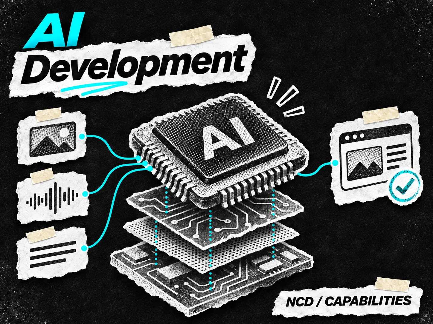
 DESIGN IT.
BUILD IT.
SHARE IT.
A practical toolkit for one very curious maker.
Show what people can make, learn, or do.
Bring a point of view, and make room for others.
Explore an idea. Build it. Share what works.
02 IDENTITY
A name. A maker.
No-Code Dan is the name. NCD is the shorthand. Use the full wordmark when there is room, and the existing monogram when space is tight.
Keep its shape. Scale the whole mark together. Use the supplied SVGs for sharp edges at any size.
Give it room. Leave at least one capital-letter height around the wordmark. Start at 120px wide; use the monogram for smaller spaces.
Avoid visual noise. Keep the logo clear of busy cutouts. Use approved colors, upright letterforms, and a readable background.
03 COLOR
Two palettes. One personality.
Cyan gives the dark palette its spark. Deep blue carries that same energy onto white. Use neutral space generously, and put accents where attention belongs.
Bright ideas.
Black canvas.
Same energy.
New light.
TRY A COLOR PAIR
Readable is part of the brand.
Body text needs 4.5:1 contrast; large text needs 3:1. WCAG AA reference ↗
A good idea should be easy to read.
AA large text: pass
04 TYPOGRAPHY
Clear words. Confident type.
Inter is the everyday voice of the site: direct, readable, and comfortable at any size. Use weight and scale to create hierarchy. Let editorial collage headlines bring the handmade character.
SHORT. SMALL. SPARING.
Make something useful.
700 / 1.1Make the first idea count.
600 / 1.15Give every chapter a clear start.
600 / 1.2Name what matters.
400 / 1.6–1.8Keep longer passages comfortable.
500 / trackedAdd context. Keep it brief.
05 LAYOUT & SPACING
Make relationships visible.
A 12-column grid keeps sections aligned inside a 1280px content width. The spacing scale grows from 8 to 89 pixels: close for related things, generous between chapters.
Good ideas.Made real.
TRY THE DISTANCE / 34PX
06 ART DIRECTION
A little paper. A lot of personality.
Torn edges, photocopied cutouts, visible tape, and a confident headline. The materials connect the collection. Each subject gets its own idea and composition.
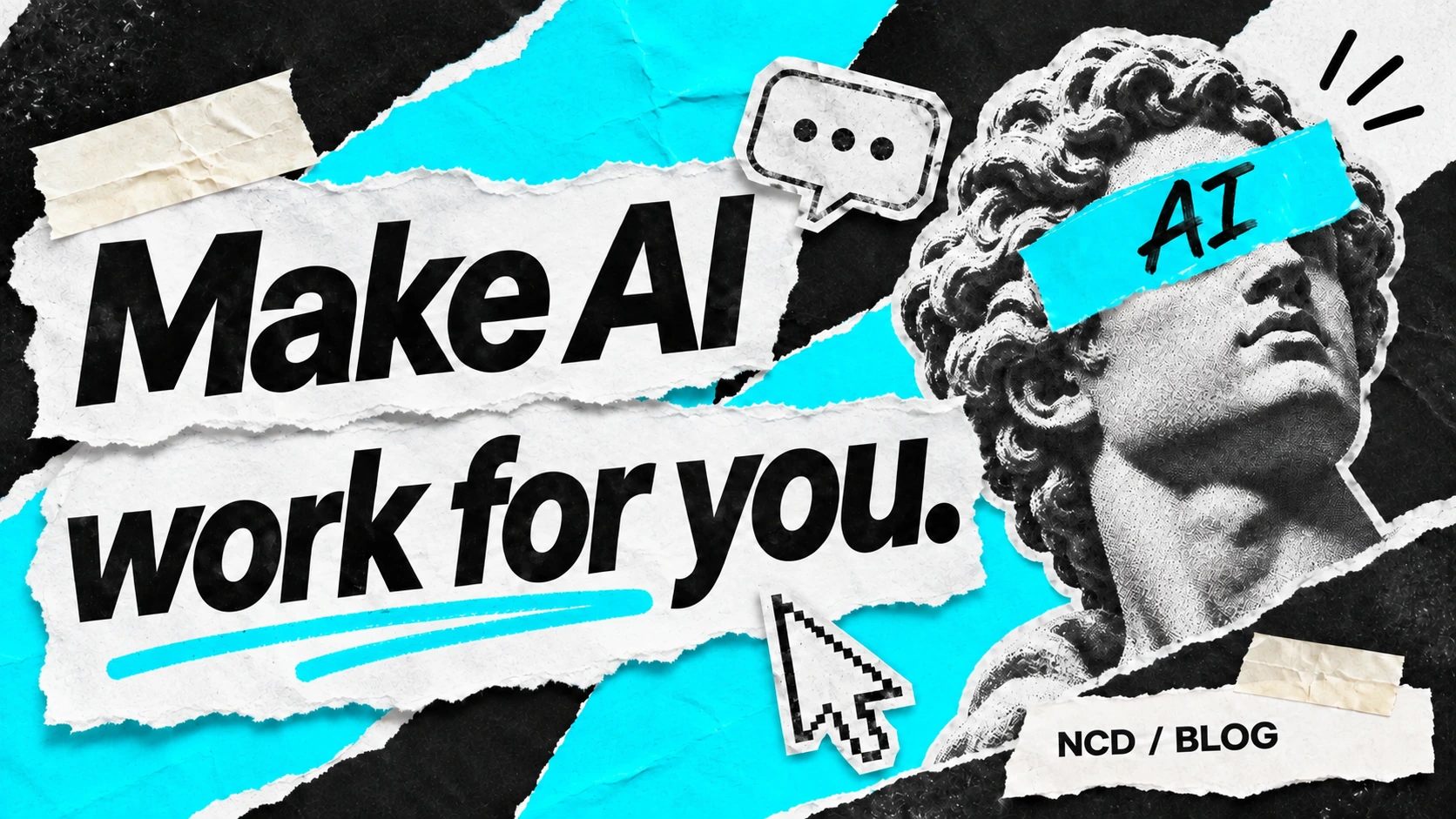
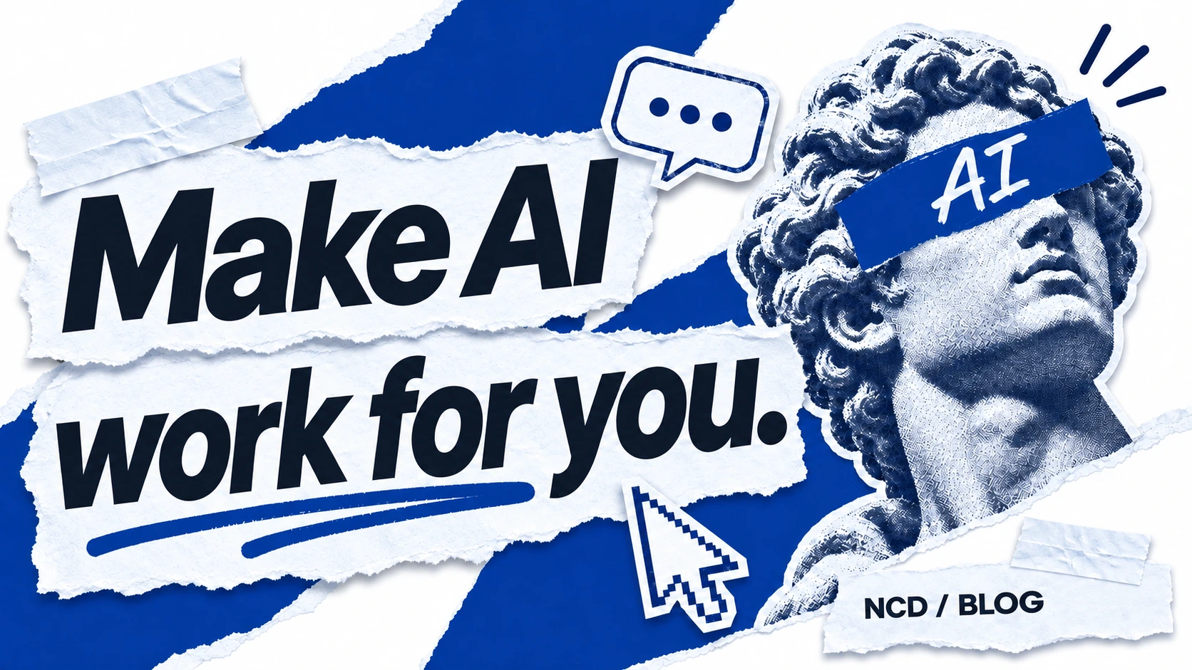


Compose blog and presentation covers for their 16:9 frame. Keep headlines inside an 8% safe area.
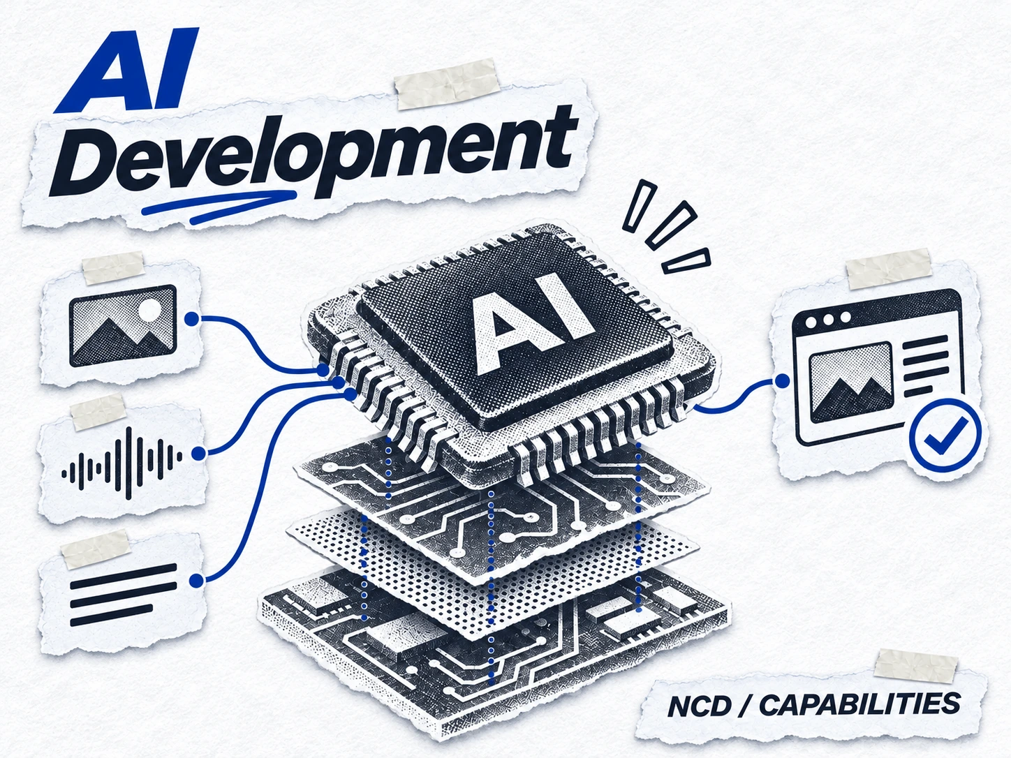
Preserve the words, cutouts, positions, and crop in each pair. Make the light version through a palette edit.
Use a small, consistent signature. Let the headline and central subject lead.
07 MOTION & ICONS
A nudge, with purpose.
Motion directs attention and explains what changed. Keep interface responses quick, give editorial reveals a little room, and respect reduced-motion preferences.
to in motion.
CHOOSE A TEMPO
A smooth ease-out, a short distance, and a clear finish. This preview uses no movement when your device requests reduced motion.
Use Lucide line icons for interface actions: 16–24px, consistent stroke weight, and a text label or accessible name. Save textured cutouts for editorial artwork.
08 VOICE & WORDS
Sound like a person who builds.
Curious, capable, and easy to talk to. Explain what something does, share what you learned, and give the reader a useful next step.
This is Dan’s personal brand. Credit collaborators by name when work is shared.
Use concrete outcomes and honest examples. Let experience carry the confidence.
Explain unfamiliar terms. Keep the language clear for people outside the tech bubble.
Lead with the thing people can do.
THE NCD VOICE
I help turn your idea into a working product with AI, design, and automation.
SKIP THE HYPE
Leveraging cutting-edge, end-to-end solutions to unlock limitless digital transformation.
No-Code Dan · NCD · blog posts · projects · workshops · clients and collaborators
09 / TAKE IT WITH YOU
Made to
be used.
Keep the system close. The brand kit includes vector logos, color and spacing tokens, a reusable artwork prompt, and a short usage guide.
Download the NCD brand kit